LODE rebranding_
ABOUT THE PROJECT LODE
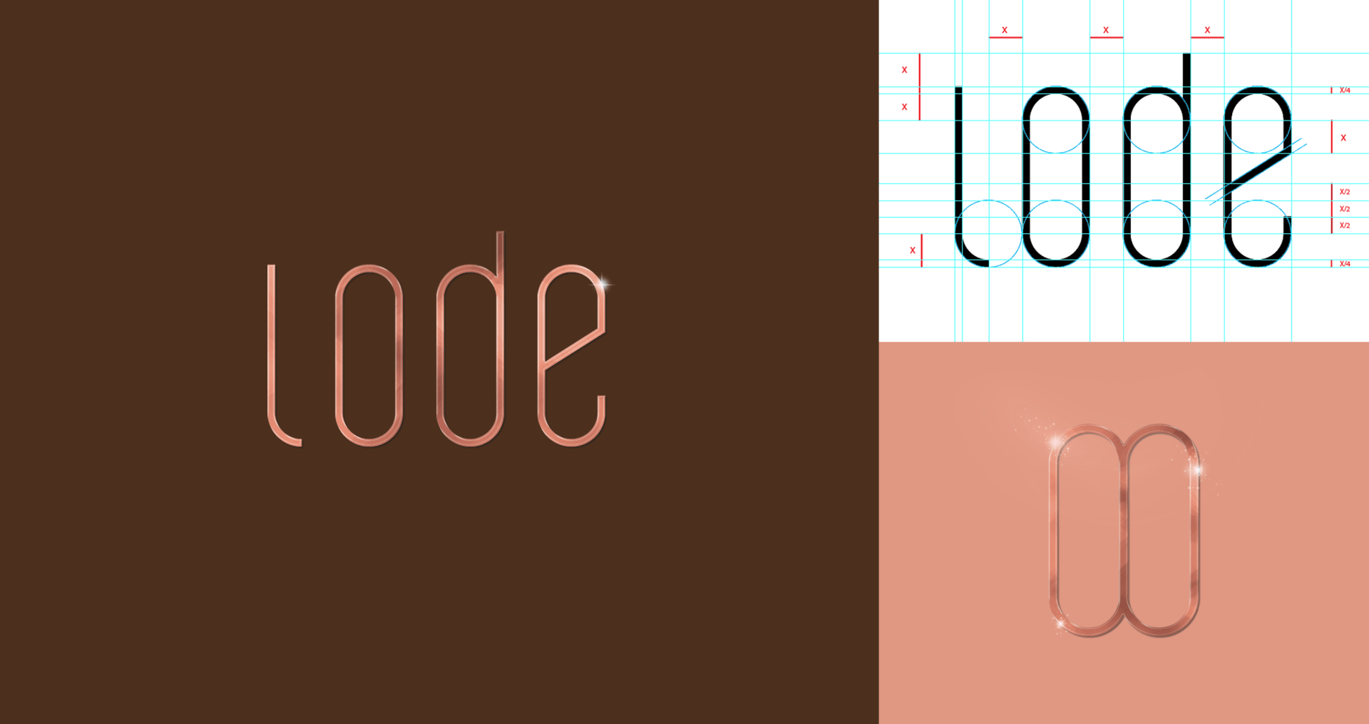
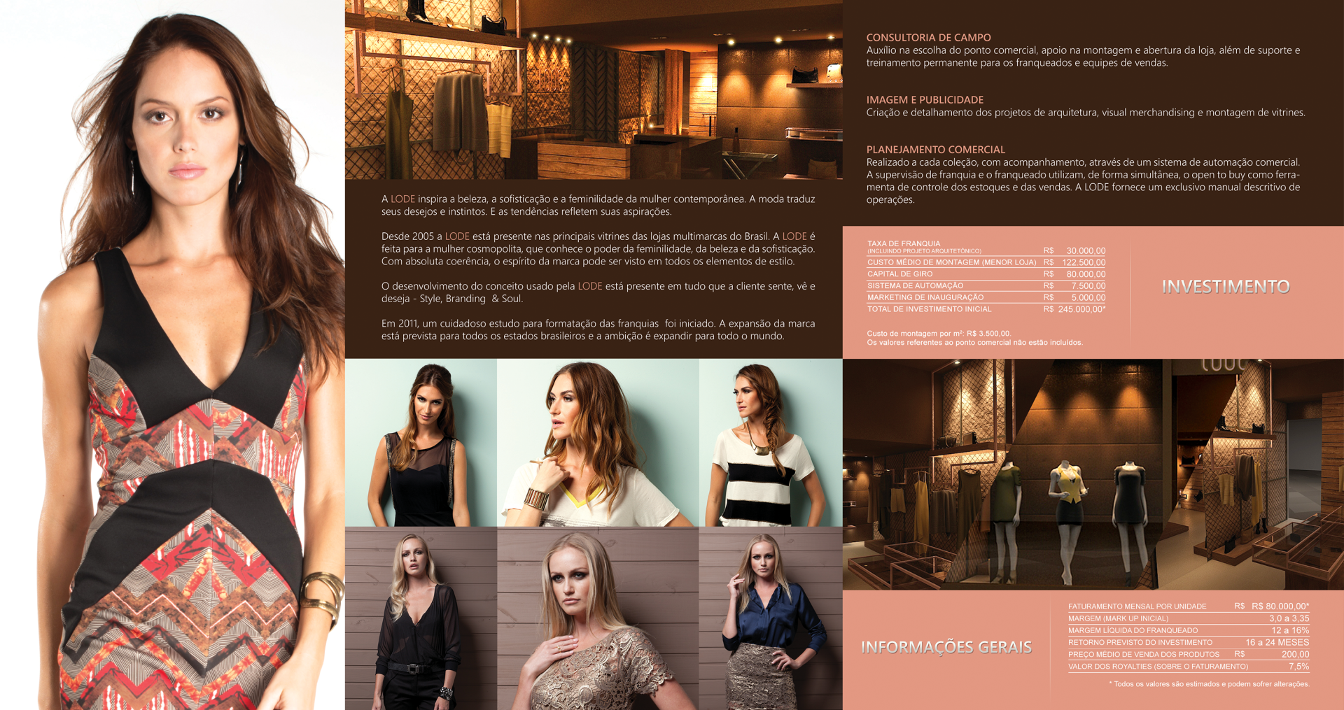
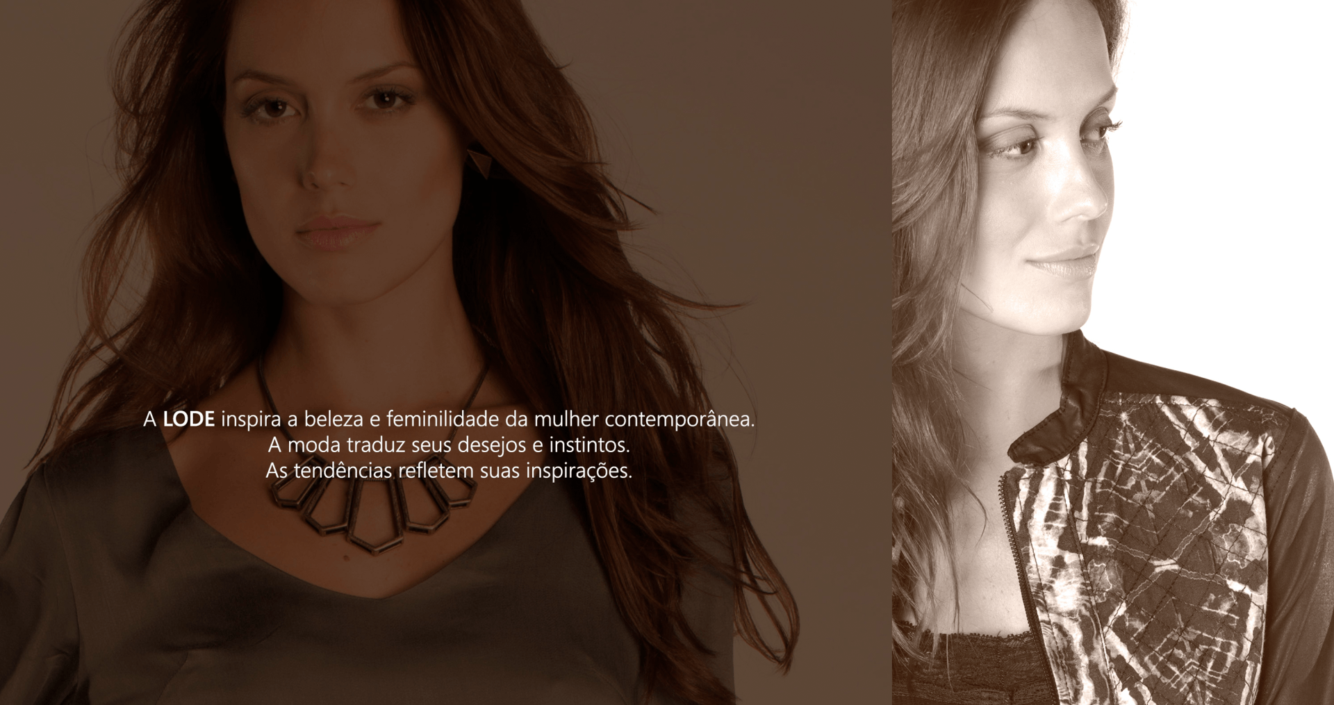
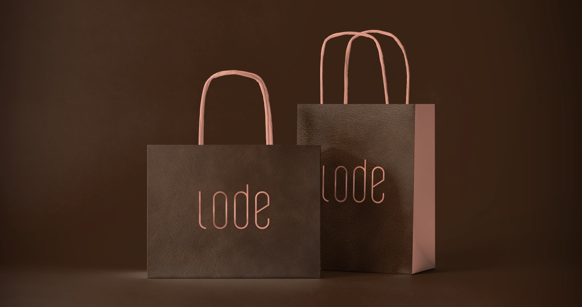
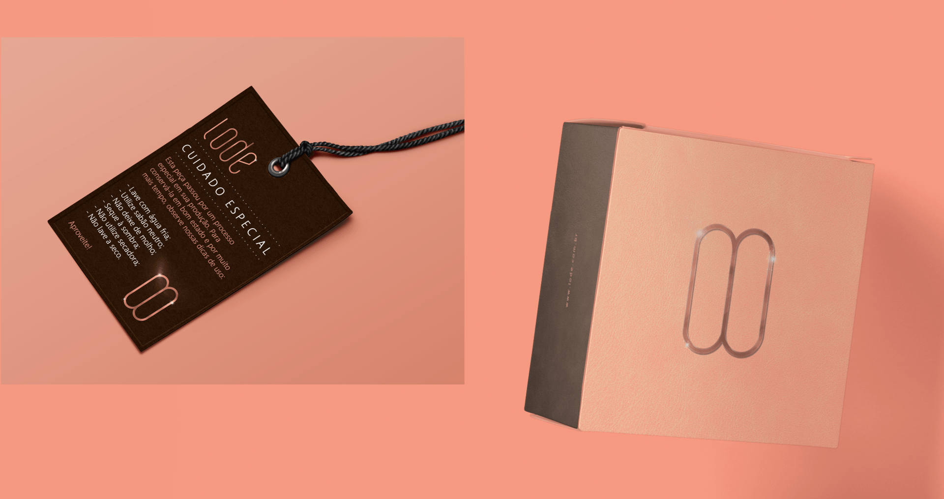
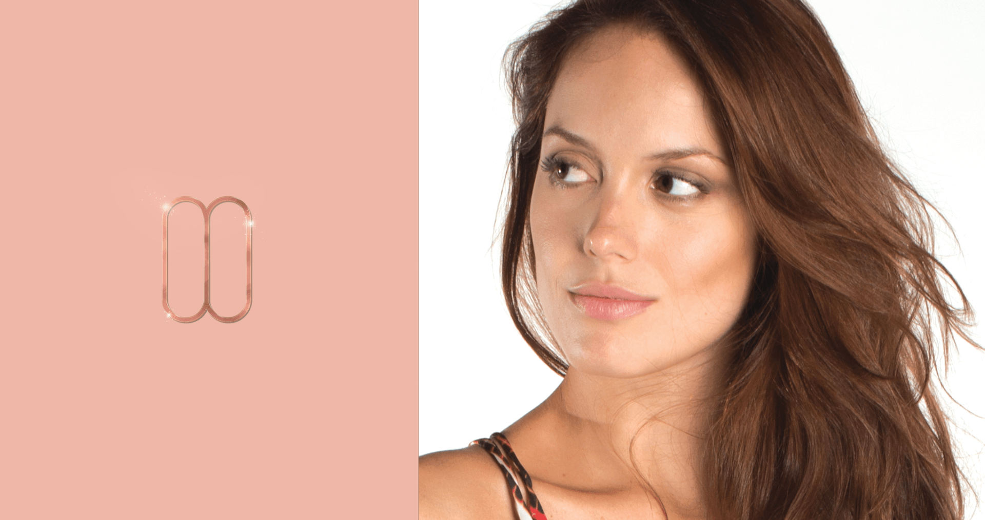
was a unisex brand and, through a long project to redefine the strategic construction of the brand platform, some very radical and, I would say almost total changes in all its construction and communication were defined. LODE brand is exclusive and all fonts were created and designed by ID_Lab. The thin and condensed font refers to the woman's femininity, who does not forget to be contemporary. The capital “L” and the other lowercase letters give us a sense of organization and beauty, outstanding characteristics of the feminine universe. Brown was chosen for the sophistication and intimacy that the color expresses. We avoided black, a very obvious color in the fashion market. This option made us open the horizon and also compare it to the color of chocolate, an important symbol of the feminine universe linked to the seduction and desire of women. We researched, among the noble metals, the one that best represented the luxury and femininity of the Lode woman. With that in mind, the “rosé gold” fits perfectly into these indications. The symbol was created to exercise and tie a unique identity to the brand. It refers to the symbol of infinity and the union of two bodies. The infinite relationship is also shown, profoundly, between the woman and her internal and external universe. It makes us visualize a jewel of bold design belonging to the universe of our persona.
WHAT WE DID
• Brand investigation and diagnosis
• Communication diagnosis
• Brand strategy
• Brand purpose
• Brand positioning
• Brand personality
• Brand Canvas
• Brand Persona
• Institutional Material
• Communication planning
• Integrated campaign
• Website
• Video
• Promotional Material
• Social Media
• Web Site
• Creative Direction
• Editorial
• Catalog
• Collection Development


